Positioning, with the source in view
Put liquidations
in context.
Watch reported liquidations beside price and order flow. Compare them with liquidation rails and covered Hyperliquid position levels.
Reported events · Liquidation rails (forward test) · Observed position levels · Rails free on BTC, Pro or Research on every market
Playback unavailable. Open the video directly.
STRK/USDT · Binance Futures 5m · Replay of 10 Oct 2026, 12:00 to 21:00 UTC: rails from Binance and Bybit as published at the replay clock, coloured by dollars while Bybit’s 24 h chance was pending, and Binance’s reported liquidations · Time-lapse, 45 market minutes per second
- 01
Liquidation rails
Rails mark where modelled positions would be forced out, in dollars, each ended by the candle that reaches it. They estimate; they do not reveal actual positions. A forward test on live Bybit data runs from 13 Oct.
- 02
Covered positions
The Hyperliquid layer uses exchange-reported liquidation prices from observed public positions. Its coverage is partial and changes over time.
- 03
Reported events
Markers show received liquidation reports. Compare what was published with the surrounding price and order flow.
The rails
Read the levels around price.
Each rail is a fixed price from the model, coloured by the liquidations expected within 24 h, or by its dollars. A profile at the right edge sums the rails still standing. Brightness is context for a question, not a destination price must reach.
See every coin’s live map and its record ↗Playback unavailable. Open the video directly.
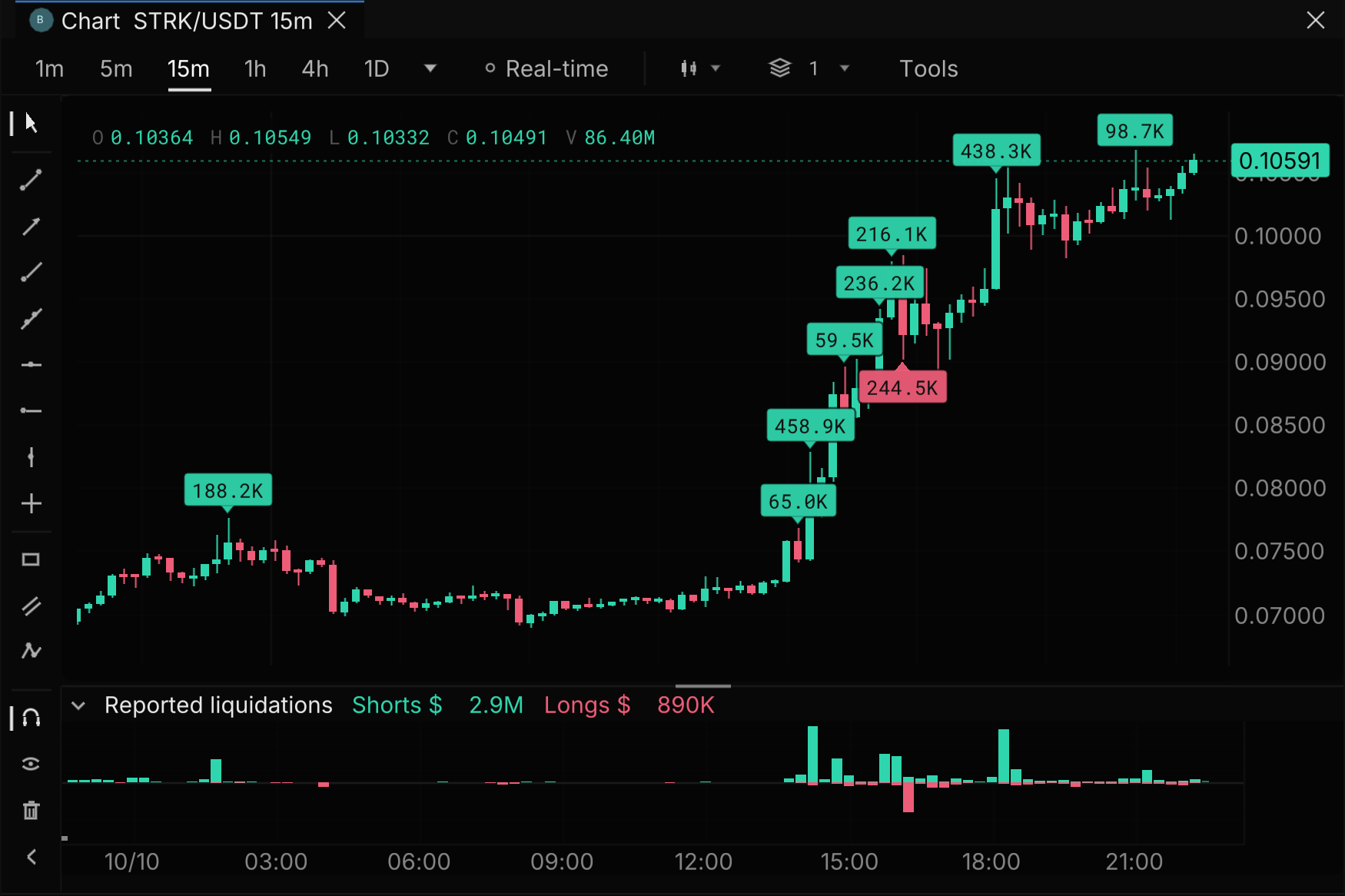
STRK/USDT · Binance Futures 15m · Reported liquidations as received · Live chart of real recorded data, 10 Oct 2026
What the exchange reported
Keep events distinct from estimates.
A callout at the wick marks a candle whose reported liquidations reach twice this market’s typical candle, and the pane below totals every candle. Read them beside price and trades without treating the published feed as a complete census.
See reported events in RT ↗Scored in public
Every level we draw is checked against what happened.Misses included.
Any tool can draw bright lines. Without a score, you cannot tell a level that matters from one that just looks good. A map that shows its misses is one you can believe when it hits.
 BTC/USDT
  Binance Futures
5 to 12 Oct 2026 · 8 scored days
9%of the time, price sat at our BTC levelsabout 15 of 172 hours scored
64%of the liquidated dollars came in those minutes$197.76M of $308.58M reported
Price at our levelsEverywhere else
7.2×the average rate of liquidated dollars, while price sat at our levels
How it is scored
- We checked 11 liquidation map and heatmap tools on 4 October 2026. None published how often its levels met real liquidations.
- The harder test is still running: we wrote down the pass and fail rules for our liquidation rails before 13 October, and publish the result on or after 16 November, pass or fail. Read the registered test →
- Liquidations bunch up in big moves, which also reach more levels, so the time bar flatters the map. Binance’s reported feed is a lower bound, so dollar figures are a floor.
Live maps by coin
Open a coin’s liquidation heatmap.
Each page draws the coin’s live levels on its last 48 hours of candles, with the liquidations Binance reported underneath and the map’s daily record. Binance does not publish every liquidation, so its figures are a floor.


In Real-time
Watch each liquidation land on the tape.
In Real-time every reported liquidation is a diamond at its price and second, sized by dollars, beside the trades and the resting book. The pane below totals the shorts and longs reported each second. Turn on Reported liquidations in the Liquidations menu; recorded replays show them too.
Explore real-time order flow →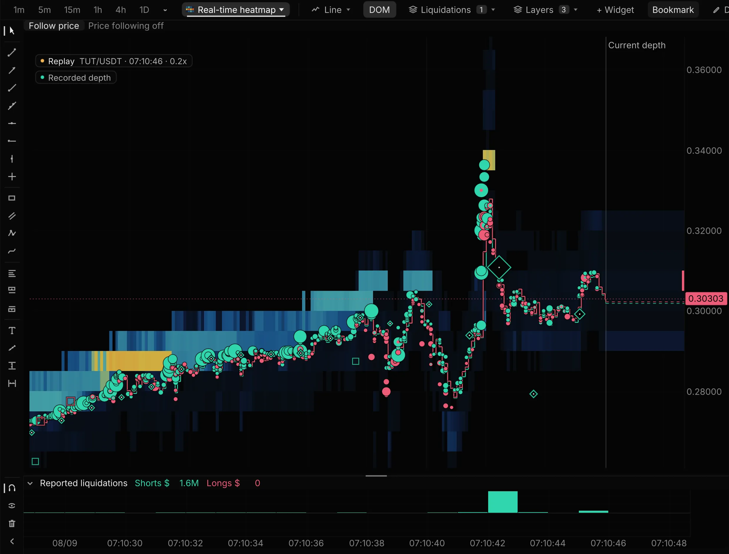
- $1.25M of shorts liquidated at 07:10:42
- Smaller reports along the climb
- Shorts and longs reported, each second
Model limits
Rails come from a model calibrated on Bybit’s liquidation record, not from known positions. In development they beat no-fuel and even-split baselines, and the 24 h touch chance was 27.5% predicted against 28.6% observed. The forward test on live data reports from 16 Nov. A rail is not a forecast that price will reach it.
Hyperliquid coverage
Our Hyperliquid node reads every wallet it has seen trade: on 15 Oct that was 98.7% of BTC open interest. Levels are drawn only where a position has a usable liquidation price near the mark, 44.8% of BTC open interest that day, and the chart’s key shows that share. Source time, age and gaps matter; present levels must not be read as what was known earlier.
Reported events and replay
Binance liquidation publications are censored and completeness is unknown. Missing events are not added as estimates. Replay depends on the selected recording and plan; opening RT does not backfill earlier liquidation reports.
Coverage and plan access vary. Compare plans · See what is in development
Explore it for yourself
Put positioning beside the move.
Open a market and choose the source layers you want to inspect.
Reported events · Liquidation rails (forward test) · Observed position levels · Rails free on BTC, Pro or Research on every market